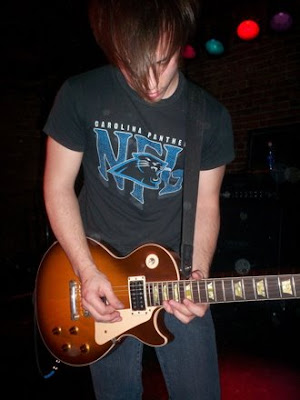
Here is the pic:

Here is the edited one:

The first thing that I did was to erase its background by making a selection using the pen tool and delete it. Next was to turn Josh’s picture into a silhouette by adding a black color overlay on its layer effect. I created a radial gradient as my background and adjust its level to show some highlights. I duplicate Josh’s image remove its color overlay and desaturate it. Using the soft brush I erase some parts of it to show some depths. Then I began adding some vector curves and glowing stars. For the finishing touches I turn it into a multicolor picture using large soft brushes scattered around the image with an overlay blending and opacity of 50%.
I always try to do my own style in designing. I apply the things I know in one single image. Yes its true, tutorials online are great but I try to create my own art by not looking on tutorials. My photoshop motto is “Design is not about the looks, it’s the imagination behind it that counts”.
I always try to do my own style in designing. I apply the things I know in one single image. Yes its true, tutorials online are great but I try to create my own art by not looking on tutorials. My photoshop motto is “Design is not about the looks, it’s the imagination behind it that counts”.

2 comments:
nice edit!:)
i really envy you.. T_T
where did you get photoshop?
Post a Comment